Business dashboard design does not begin with a chart library. It begins with a question: which decision should the owner be able to make within five seconds of opening the page? Without an answer, the dashboard becomes an attractive warehouse of metrics that changes no behavior.
An owner needs a small set of trustworthy signals, compared with a target or relevant period, followed by exceptions worth attention and a path into detail. This guide shows how to build that hierarchy without decorative charts or misleading color.
Write decisions before metrics
Interview the role about daily, weekly, and monthly decisions. The owner may adjust staffing for a busy period, follow up delayed claims, replenish stock, or contact accounts due for renewal. For each decision, record the required information, threshold, action, and owner.
Remove a metric that supports no decision or recurring question. It may belong in analysis, but the primary dashboard has a limited attention budget.
Keep one operating level per view
The owner view differs from an operations manager queue and an employee task screen. Owners need health and exceptions, managers need allocation and backlog, and staff need the next action. Combining all three produces density without clarity.
Use role-specific views and permissions. Do not expose personal or financial detail merely because it can fit on a chart.
Define each KPI as a data contract
For every KPI, document name, meaning, formula, source, filters, timezone, refresh frequency, owner, and treatment of refunds, cancellations, and late data. “Daily revenue” might mean issued invoices, collected payments, or net settled value.
Make the definition accessible. If finance and operations calculate the number differently, resolve the contract before styling the card.
Never present a number without context
Compare the current value with a goal, a comparable previous period, or an approved operating range. Avoid comparing a complete day with one still in progress. Display period, timezone, and last refresh.
Absolute and percentage change can both help, but color cannot define whether movement is good. Lower wait time may be positive while lower collection is not.
Build a top row that states health
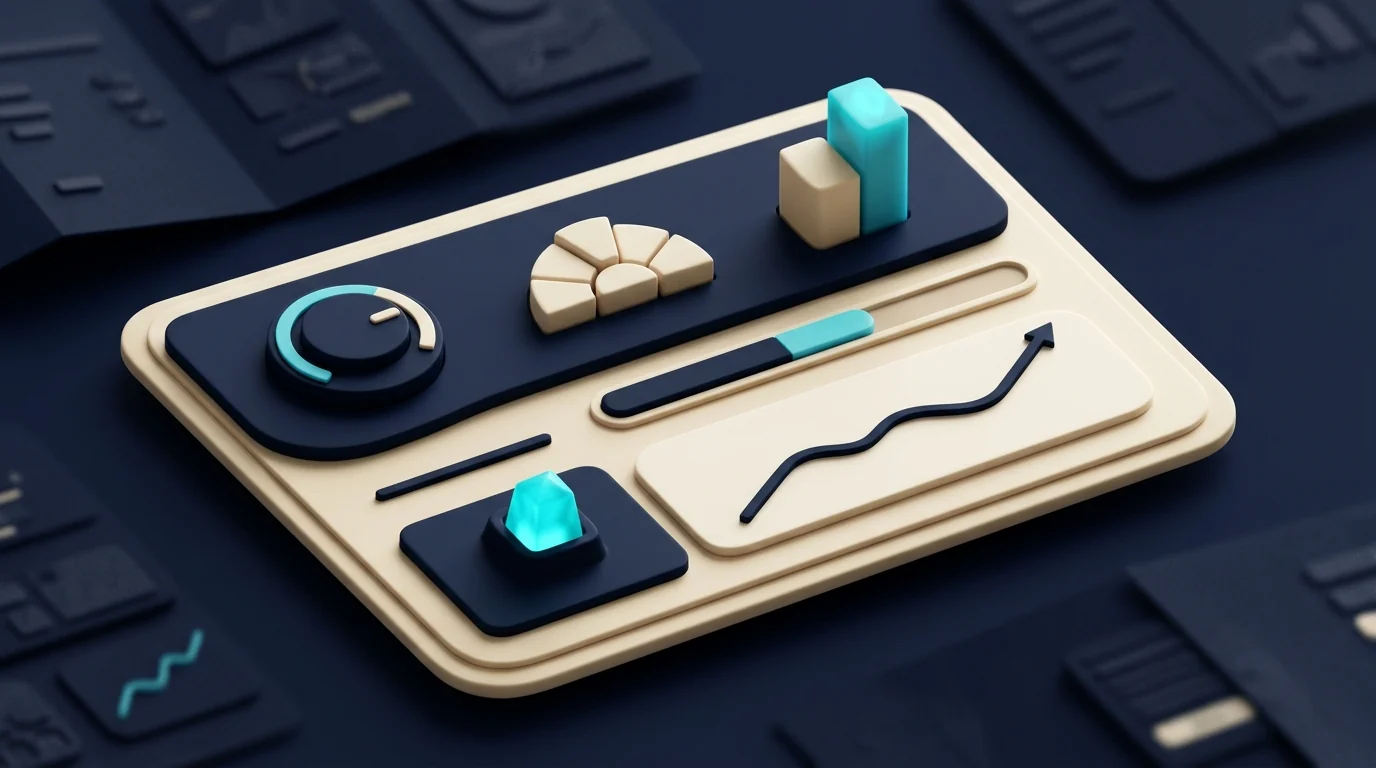
Use a limited number of stable, ordered status cards. Each needs a clear label, value, comparison, and freshness. A small trend spark can help. Gauges and decorative rings often consume space without increasing understanding.
Below that row, show the exceptions or trends that explain the change. The visual sequence should answer what happened, where, and what action follows.
Make exceptions actionable
“Twelve overdue claims” is useful when the user can open a list ordered by age, value, reason, and owner. A number without a drill path creates another question. Preserve filters when navigating to detail.
Show cause and responsibility where available. The dashboard is an entry to a workflow, not a replacement for it.
Match the chart to the question
Use a line for time trend, bars for a small category comparison, a table for exact values, and progress only against a meaningful goal. Avoid pie charts with many similar segments. Do not use a map unless location changes the decision.
Label units and periods. Avoid truncated axes that exaggerate small movement and dual axes that combine unrelated units without a clear reading task.
Use color as a signal
Reserve state colors for consistent meanings such as attention, overdue, or complete. Keep information understandable without color through labels, icons, or patterns. Test contrast and common color-vision differences.
If everything is red, nothing is prioritized. Base severity on defined impact and escalation, not visual drama.
Design Arabic RTL and English LTR together
Mixed Arabic, numbers, currencies, and Latin names create direction challenges. Use logical alignment and test realistic branch and product names. Directional icons should follow meaning, while fixed symbols should not mirror automatically.
Write native labels rather than literal analytical jargon. Our web and PWA service treats direction, responsive layout, and accessibility as component requirements.
Treat mobile as a decision surface
On a phone, show the most important health signal and actionable exceptions first. Do not compress a ten-column table. Use selected columns, expandable rows, or record cards when the task fits.
Test on an ordinary device and connection. A dashboard waiting on many heavy queries will not be read in five seconds.
Declare data freshness and quality
Display last update and source where they matter. If refresh fails, mark the number stale instead of presenting it as current. Distinguish no data from zero.
Monitor source completeness, delayed jobs, and unusual changes. Dashboard trust cannot exceed pipeline trust.
Avoid unnecessary real-time updates
Not every KPI needs a second-by-second stream. Daily collection may refresh periodically; a monthly report can wait for close. Real-time infrastructure adds cost and can show unstable values before reconciliation.
Set cadence from the decision. Provide a clear timestamp and manual refresh where useful. Accuracy comes before animation.
Keep filters understandable
Period, branch, team, and channel are common filters, but too many create screenshots that cannot be compared. Use sensible defaults, display active filters in the title or shareable state, and offer reset.
Authorize every option. A filter must not reveal a tenant, branch, or customer the user cannot access.
Test with short tasks
Ask the owner to open the dashboard and answer: Is the operation healthy? What is the largest exception? What should happen next? Observe hesitation and vocabulary questions without explaining the interface.
Test zero, high volume, stale data, partial failure, small screens, Arabic, and English. Add automated tests around KPI formulas and permission boundaries.
Measure the dashboard itself
Track which cards lead to detail, which filters are used, and which questions still reach support. An ignored chart may be irrelevant or distrusted. Interview before removing it.
Review the dashboard when business goals change. It is a product, not a one-time design deliverable.
Use domain-specific structure
A clinic owner might see today’s collection, upcoming appointments, and insurance items needing action, followed by a weekly trend and exception queue. A field-service owner might start with overdue orders, unavailable assets, and part wait. The pattern stays decision-led while the data changes.
Our technology approach connects performance and observability to product design. The preventive maintenance guide shows how an overdue indicator should lead into an owned work order.
The five-second finish
If an owner can identify health, exception, and next action, a simple dashboard has succeeded. Start with three recurring decisions, document three KPI contracts, and test a realistic prototype. Add only what proves useful. Submit the dashboard workflow with the decisions your team revisits every week.